UI design: give lots of space to the main target
25 April 2024
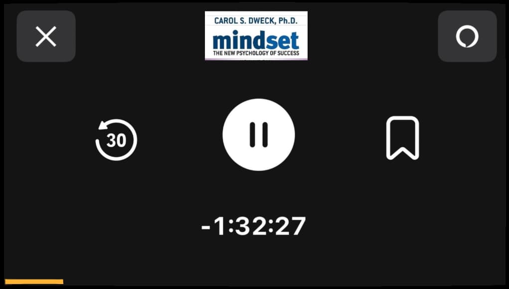
Yesterday in the car I was listening to a book on the Audible app. Cell in landscape mode, because otherwise it covers my car clock.
I tap the "go back 30 sec" button, the first one on the left, quite often. Since it is not very wide and I am driving, TARGETING THE BUTTON IS NOT EASY. Half the screen is taken up by the picture of the book cover, which is useless info while I'm listening, because I know what I'm listening to.
How I wish the app was:
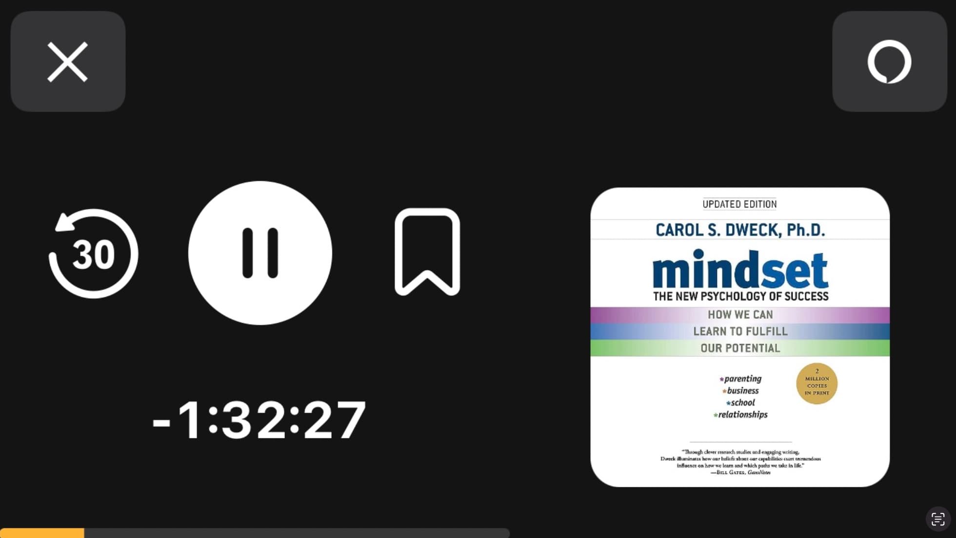
In fact, maybe I would give up the symmetry of the 3 buttons, push the one on the right, which I never use, to the right giving even more space to the "-30 seconds" and "pause." And if you really don't want to give up the book title info: